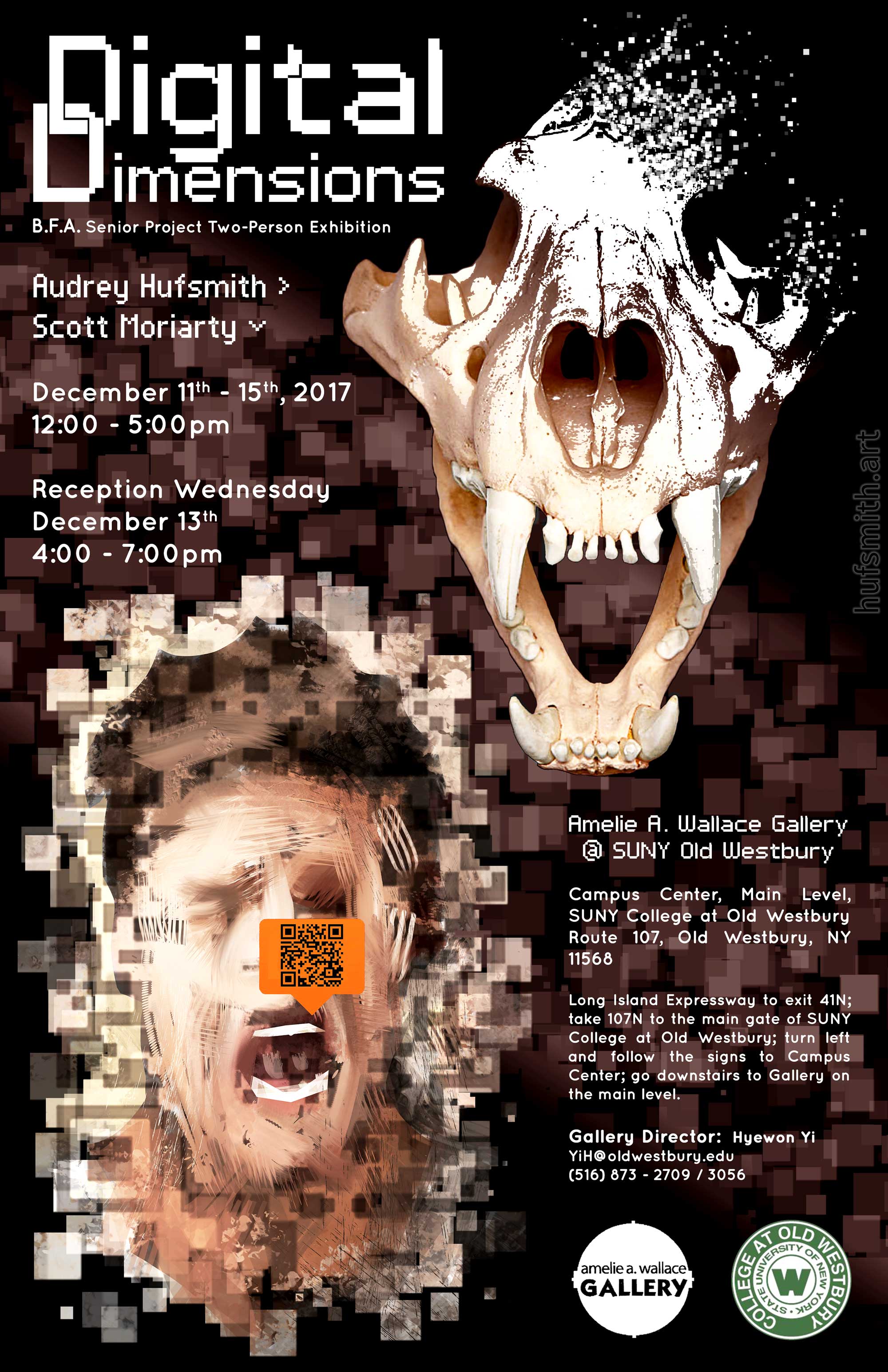
Digital Dimensions
(Senior Project Poster)

Year:
2017
Original Size:
17" x 11" at 300dpi
Media:
Graphic Design
Software Used:
Adobe Photoshop CS6
Description:
This is the poster I designed for my senior project exhibition. The exhibition title relates to the common theme between my exhibition partner's and my work: our use of digital multimedia. I used squares to evoke a sense of pixellation. The dissolving skull in the upper right is a nod to my video pieces "Memento Mori" and "Evolution/Dissolution". His work in the bottom left is part of his series where he uses QR codes to enhance the experience of his pieces.
I really enjoy working at "tabloid size" because most print shops can produce reproductions quickly and at a low cost compared to larger sizes. With 300dpi, you can double the size and end up with a 34" x 22" poster at 150dpi which still looks quite decent at a normal viewing distance.